Much like the outcome of a meal is reflected by the quality of ingredients used, an individual’s retirement is shaped largely by the value and features of the plans offered to them. But sometimes, just having access to a plan doesn’t yield results, especially for new savers. Human Interest has been committed to making it easier to save for retirement from our beginning. We believe that simple design and expert 401(k) guidance can be a recipe for success—and that with the right tools, anyone can navigate the path to secure a better future.
As we’ve grown, we've improved the usability of our products based on customer research and prototype testing. Although we’re a technology company, Human Interest is driven by human-centered design. By taking the needs of our customers into consideration, we streamlined participant enrollment and reimagined their account overview to make it easier for employees to make the most of their 401(k) plans.
Our aim was to build an experience that helps participants:
Quickly set up their 401(k) plan today
Make the most out of their accounts tomorrow
Understand and select investments to save for the future
Below, we’ll review the goals of our latest product redesign—and how positioning products around the needs of plan participants can help them save for retirement.
Get started with an affordable, full-service 401(k) plan.
1. Improving the onboarding process
One of the biggest hurdles of setting up a 401(k) is the signup process—and the bulk of our redesign focused on simplifying onboarding for all employees. For many of our customers and their employees, this is the first time in their careers that they've had access to a 401(k). As new savers, selecting 401(k) type (traditional vs. Roth), portfolio allocation, and contribution amounts may be difficult. Using behavioral science concepts, we streamlined the following components of the signup flow for savers who prefer a hands off experience:
Steps: More than half of 401(k) plan participants feel they’re presented with more information than they can absorb. To avoid information overload, all actions in the signup process are of equal difficulty, so no one step feels like a showstopper.
Defaults: By setting default contribution rates, participants are more likely to contribute to their accounts—and start saving in the first place. Defaults work in part because they are a form of social proof.
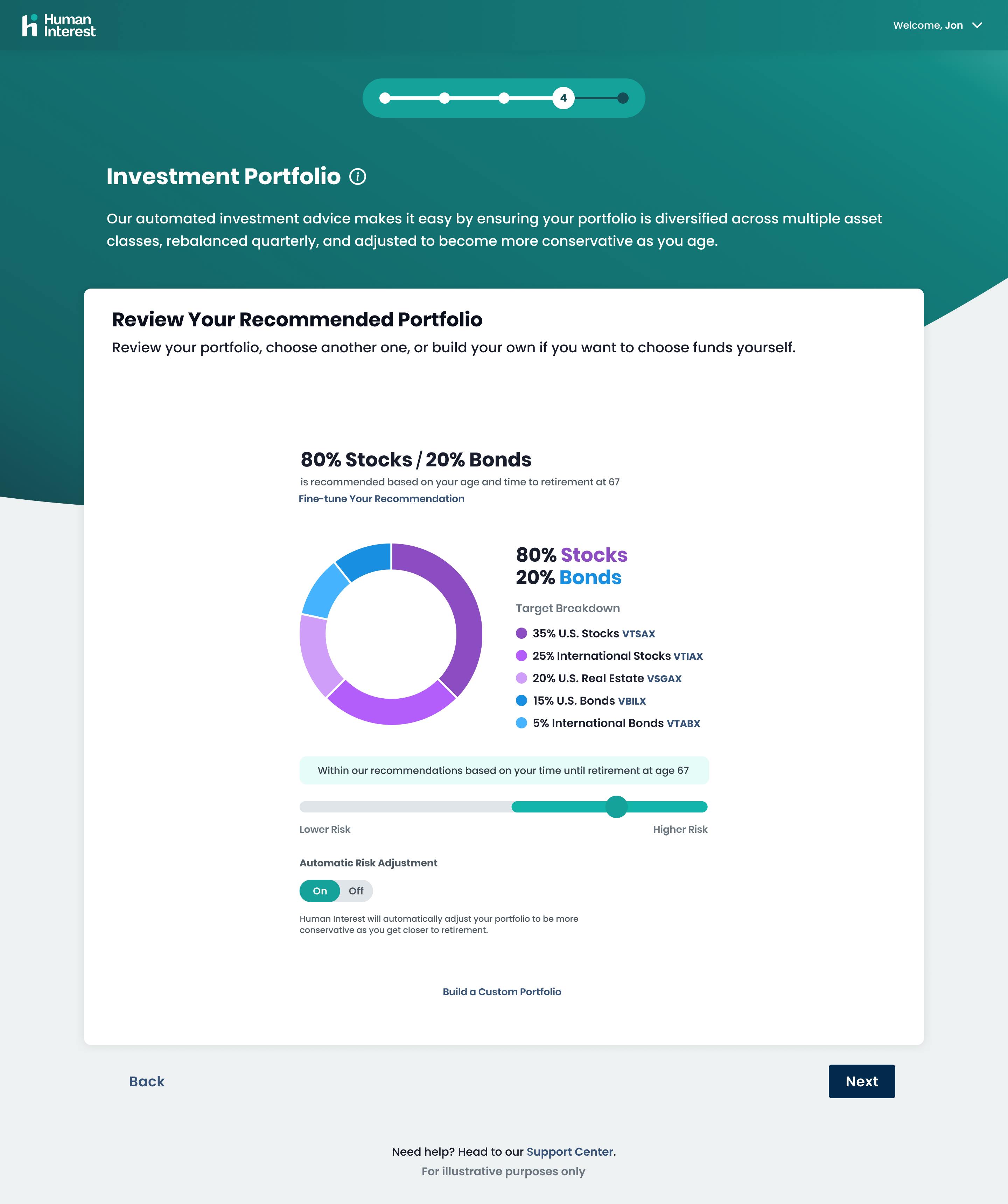
Anchoring: The onboarding process now anchors new users to plan types, portfolio allocations, and more based on age and time to retirement (which we default at 67, the full retirement age specified by the Social Security Administration).

For those that prefer more robust portfolio recommendations, a detailed retirement planning questionnaire can help customize plan design. We now display investment breakdowns so participants can better understand stock and bond fund allocations and compare portfolio options. We've also simplified the experience for hands-on investors who want to actively manage their portfolio and investments by linking to detailed fund information and improving investment allocation menus.
2. Empowering employees to make the most of their savings
In our testing, we observed three main strategies participants follow when choosing a contribution amount, all of which needed to be supported in the redesign:
Contributing a specific amount based on budget or goals
Contributing just enough to take full advantage of their employer match
Contributing the max allowable to reach the annual IRS limit
We found that too many Human Interest participants didn’t meet their employer match, resulting in an average of $1,248 lost per employee, according to internal participant data in 2020. We also discovered participants needed help understanding contribution limits (for example, many mistakenly included employer match in contribution estimations). To account for this missed opportunity, our new experience is designed to make it easier for employees to get the most of their employer match—or reach annual contribution limits—in one click.

Our studies with participants have also shown that many found visual cues to be helpful when calculating contribution levels. We now visualize the dollar amount that participants are saving per paycheck based on the contribution rate they choose and their annual salary. And we implemented features such as a button that automatically maxes out contribution levels to the IRS limits for participants, which makes it easier to save.
3. Helping participants find the information they want
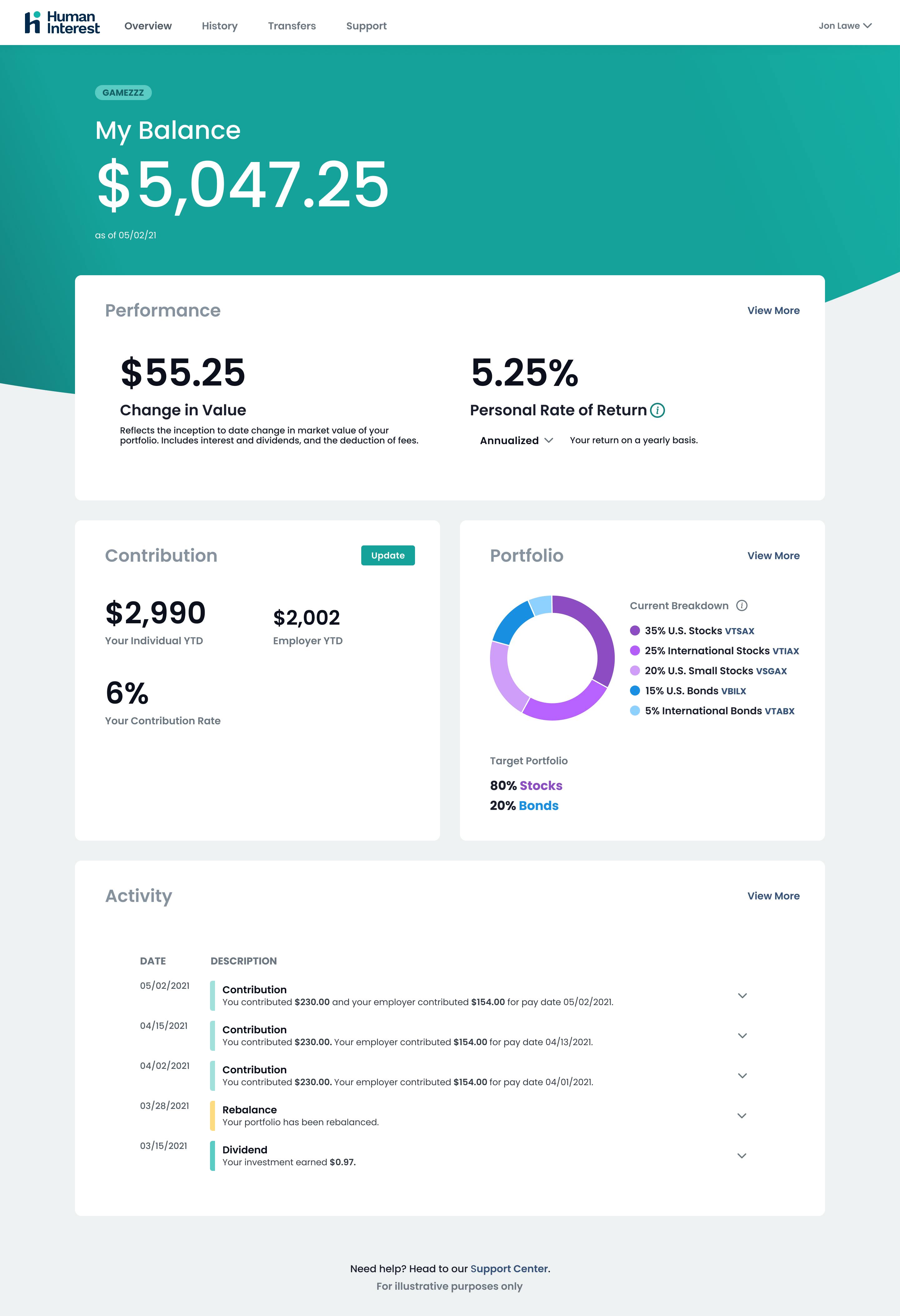
While it was critical to simplify the signup process, we also wanted to improve the participant experience after onboarding. Why do participants log in to their accounts? What information do they want after they’ve set up their 401(k)? In our testing, we discovered employees use their dashboard to:
View their balance
Monitor portfolio performance
Check on contributions and other transactions

Because participants want to understand their 401(k) performance, we redesigned the experience to help them easily locate information they deem most important. When a user first logs in, they’re given an overview of their account, including current account balance, front and center. From there, users can glean granular insights around performance, contributions, portfolios, and recent activity. To further humanize the user experience, we removed jargon-heavy language around “risk setting,” as we found this did little to help employees. To help create a more transparent product, we now surface the breakdown of funds in their portfolio, so participants see how their money is being invested.
Creating a more attainable financial future
Our simplified enrollment and redesigned information architecture helps demystify and streamline the entire investment experience, so employees can overcome the biggest hurdles of plan participation and locate important information. By showcasing what users want upfront—and throughout—their experience, we aim to improve participation rates and increase contributions, so employees can feel confident they have enough money to retire.
Our redesign was guided by the following design principles:

| Human | Empowering | Trustworthy |
|---|---|---|
| Show up in a human way – no jargon or complex visualizations | Make decisions easy by removing complexity | Be transparent in all we say |
| Communicate with purpose, say only what really matters | Put the customer in control and offer guidance | Be consistent in all we do |
| Anticipate customer needs and and offer proactive support | Remove friction, but don’t let simple become simplistic | Always deliver on our promises |
Human Interest Design Principles
401(k) plans continue to be a vital component of financial wellness, and for some Americans, the first step in saving for retirement. However, we believe that the needs of many employees have traditionally been ignored by the 401(k) industry. As Human Interest grows, we’re committed to continuing to break down the walls of a complex investment space—so that investors of all types can set themselves up for retirement. This new participant experience is a giant step towards accomplishing that goal.
Meet Human Interest’s affordable, full-service 401(k) solution. Click here to get started today.
Low-cost 401(k) with transparent pricing
Sign up for an affordable and easy-to-manage 401(k).
Article By
The Human Interest TeamWe believe that everyone deserves access to a secure financial future, which is why we make it easy to provide a 401(k) to your employees. Human Interest offers a low-cost 401(k) with automated administration, built-in investment education, and integration with leading payroll providers.


